It’s only been a few weeks since Kanye West dropped “The Life of Pablo,” working the Internet into a fine frenzy (or 17) over things including, but not limited to, a lewd Taylor Swift reference, a fiery Chance the Rapper feature and, of course, a batshit crazy album cover. The world had never seen something so intentionally sloppy and undercooked since… well… Drake’s “If You’re Reading This, It’s Too Late” mixtape, which dropped around this time last year. (At least we got some sick meme generators from them both.) Still, if these seemingly childish and ill-conceived covers were artistic decisions, they deserve to be viewed with a level of respect for the artists’ intentions. They also got us thinking about some of our own favorite album covers, which were arguably much better artistic decisions, to say the least.
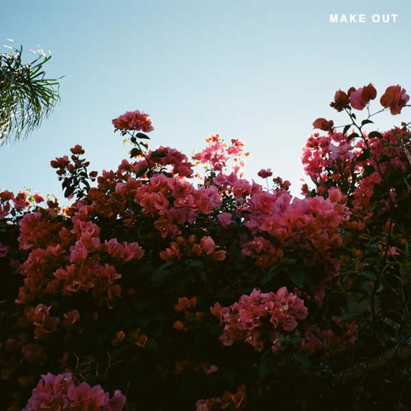
Amy — LANY, “Make Out”
I may be slightly biased because I’m currently crushing on all of LANY’s music, but the cover of their “Make Out” EP is too visually stunning to not share. The image has a simple romanticism that’s consistent with the six light and poppy love tunes that fill the EP. What makes it even better, in my eyes, is that lead singer Paul Klein took the photo. He bought an old 35mm camera from 1994 on Amazon, and the first image he shot is the one you see. As an independent gal, I appreciate that the band created the cover without the touch of a middleman. It feels personal, and like I’m seeing the vision of the album through Klein’s eyes. It’s laidback, whimsical and delicately beautiful. And can we talk about that lighting?
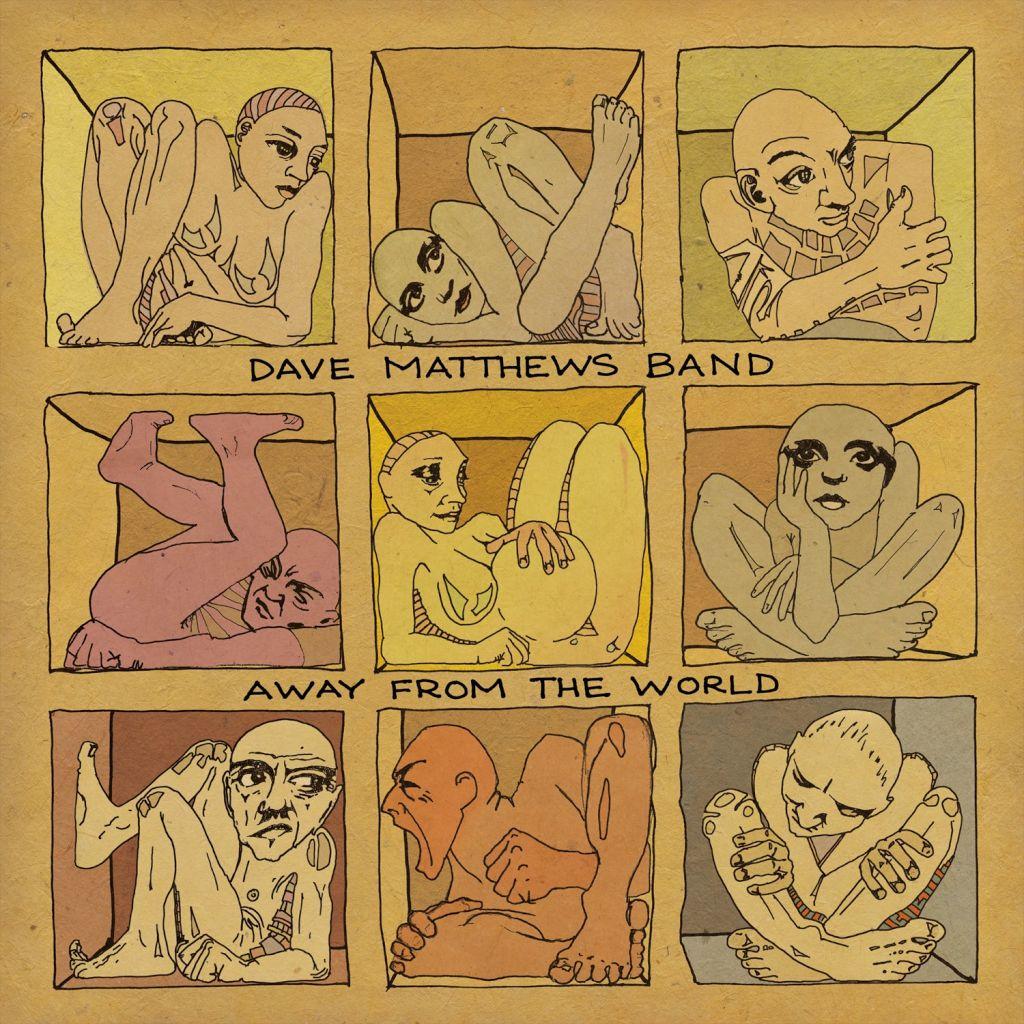
Kaitlin — Dave Matthews Band, “Away from the World”
Dave Matthews Band chose to release their latest album on Sept. 11, 2012, and the themes of introspection on songs like “Mercy” and “The Riff” match the somber release date. Matthews himself designed the cover art, which illustrates nine anxious and despaired figures stuck in uncomfortable boxes. Considering the content of the album, the artwork seems to highlight humankind’s tendency to lock itself up away from the world. It is a simplistic, yet profound work that sets the tone for the entire album.
Molly — Sia, “Some People have Real Problems”
The most striking thing about this album art is its simplicity. Drawing on her face with Crayola markers and using what looks like Microsoft Paint to add the album title, Sia made an incredibly crude and basic cover on the design end. But to me, nothing could be further from the truth. Sia’s expression reads a million different ways, but more than anything, she appears naïve — a lovely contrast to her songs, which are powerful and introspective in a deeply striking way. This photo seems to capture something fleeting, but it’s hard to pin down exactly what that something is.
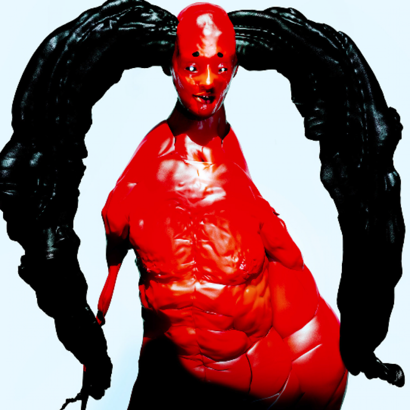
Armando — Arca, “Mutant
The pairing of artist Jesse Kanda and producer Arca is a match made in heaven. Kanda’s disturbing art is a great compliment to Arca’s harsh and unforgiving music, and the ensuing project creates beauty out of things that are initially horrifying to look at. The album is scary and confusing at first, but once you get past your first impression of the music and artwork, it’s a rewarding experience. Kanda and Arca both transform the mundane into something remarkable with their artistic contributions, creating an almost orchestral piece that leaves listeners thinking long after the album is finished. Those looking for something challenging need look no further than this album its accompanying artwork.
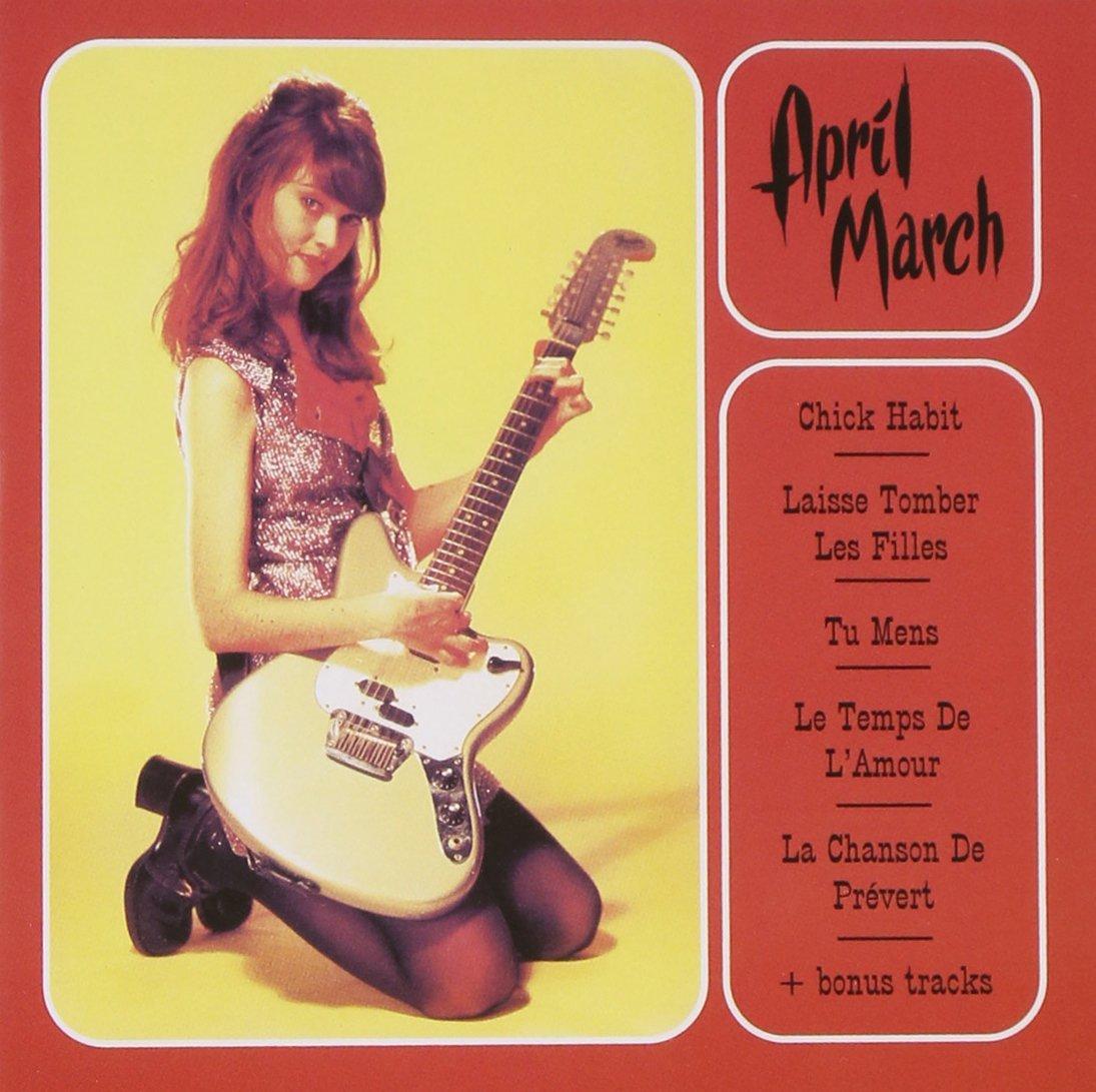
Rachel — April March, “Chick Habit”
Singer-songwriter Elinor Blake, better known as April March, looks like a badass, Sailor Moon-esque, 1960s rocker girl on the cover of her 1995 EP. The simple lines, bright colors and on-point typography work perfectly with March’s poppy, high-pitched mix of French and English songs. March gives hope to American girls everywhere that you can learn a different language and transform yourself into a 1960s French yé-yé girl if you try hard enough (and declare Françoise Hardy as your personal god.) The title track appears in two excellent female-centered films: Quentin Tarantino’s “Death Proof” and “But I’m A Cheerleader,” a satirical comedy about a conversion therapy camp. March’s amazing fashion choices continue onto the back cover where she’s shown wearing a high-waist bikini with a creepy baby doll. Then again, her striking visual taste should come as no surprise, as she also served as the principal animator for “The Ren & Stimpy Show.”
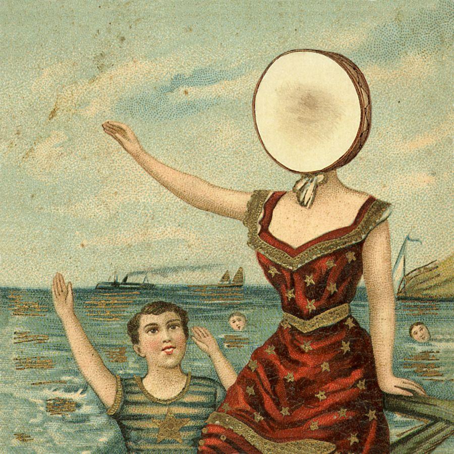
Ignacio — Neutral Milk Hotel, “In the Aeroplane Over the Sea”
The cover of Neutral Milk Hotel’s magnum opus gained icon status, becoming a staple image in the milk crate-contained, budding record collection of any entry-level audiophile, as well as more recently in widespread Internet culture. The cover itself is nothing more than a simple edit of an old-timey European postcard, but my affinity for it comes largely from the fact that to this day, the identity of the object superimposed over the waving woman’s face is a subject of debate. While some heretics argue that the object could be a coconut or a potato, I adamantly maintain my stance that it’s is a tambourine or drum, considering it’s on the cover of a MUSIC album. Regardless, the juxtaposition of mundanity and surrealism set this album cover apart from the rest of my favorites. As for the actual identity of that element: you be the judge.
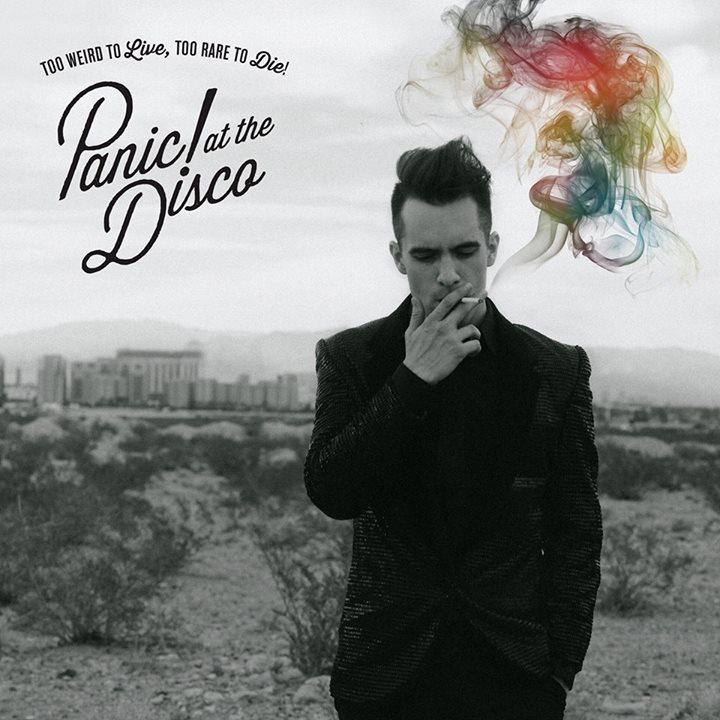
Amanda — Panic! at the Disco, “Too Weird to Live, Too Rare to Die!”
We all know Panic! At The Disco’s reckless, tortured-soul attitude is part of their charm, but the album cover of “Too Weird to Live, Too Rare to Die!” takes a darker and classier approach to the usual aesthetic. Swirls of multicolored smoke trail from a lone man’s cigarette, the only source of color amidst a ghostly gray city in the background. Lead singer Brendon Urie is sharply dressed in all black, with nothing but his dwindling cigarette for company, making a picture as hauntingly sophisticated as the tracks on the album. The sound of “Too Weird” is just as contradictory as its image. Eerie melodies with electric, synth-driven beats that mimic the pace of neon-lit nightlife, but the lamentations of a tormented rock artist are still present in Urie’s vocals and lyrics. It’s another reinvention of the band’s sound, fusing cool Vegas nightclubs and sweaty, stadium rock shows. The result is chilling and magnetic, just like the man in black surrounded by a splash of color on the cover.






















ORANGE Magazine • Feb 29, 2016 at 9:15 pm
this is so random but the for the neutral milk hotel, i feel the object is a cross stitch over her head